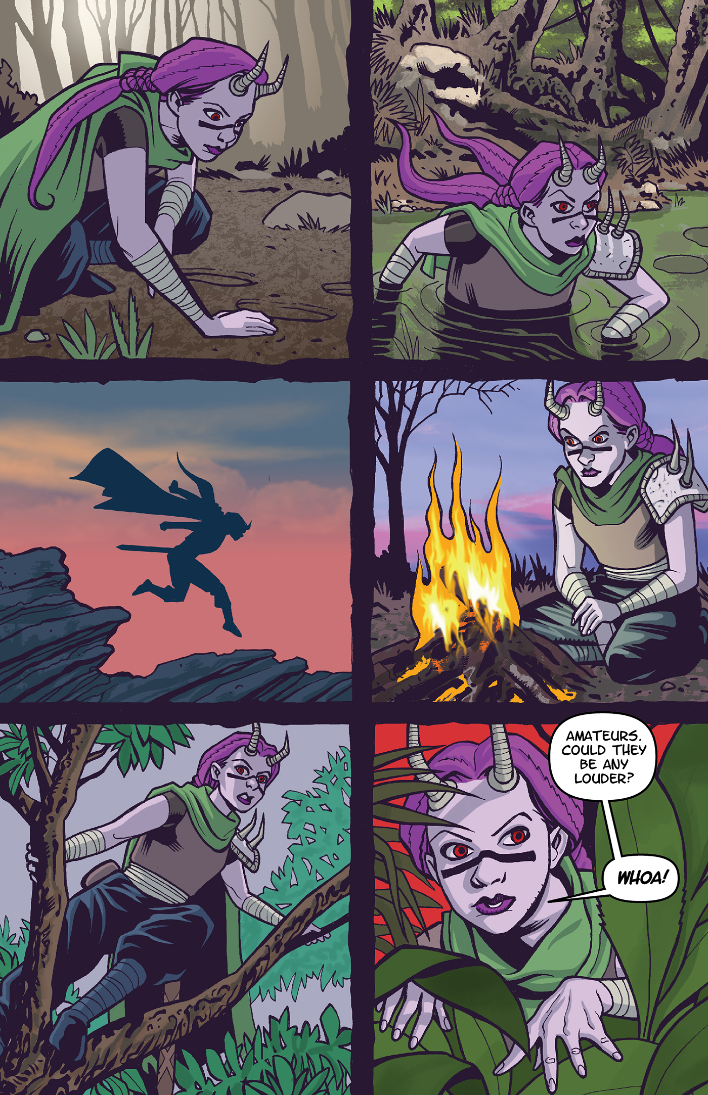
On this page of Moon Hunters I had to show a bit of a time jump. I opted to go with the ragged borders to show something was different here. Combining that with the changing of scenery and lighting and I think it came off pretty well. It’s not as smooth of a page as the previous page but still works pretty well overall.
Moon Hunters Issue 1 Page 17

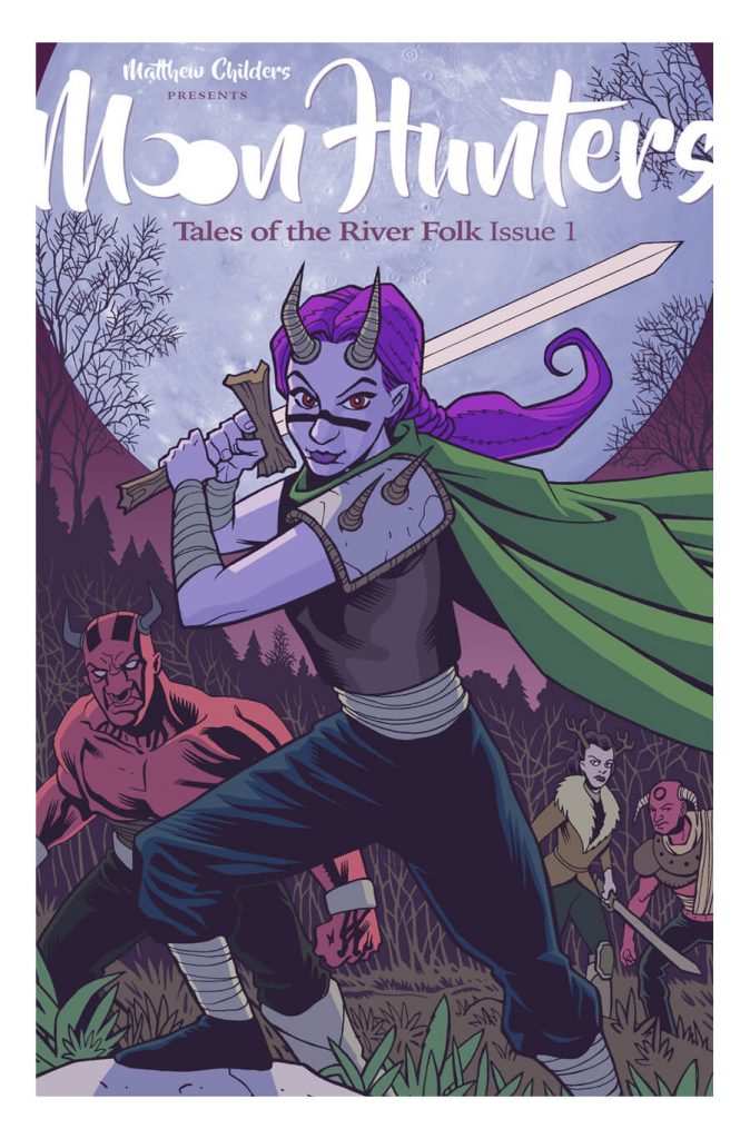
Moon Hunters: Tales of the River Folk is a fantasy comic written and illustrated by Matthew Childers. It tells the story of a young headstrong Hornling girl named Lyria, whose misadventures put her people in grave peril and her quest to right her wrongs and protect her fellow River Folk.
Get notified by email when new pages drop.

Sign up for our newsletter and get notified by email every time a new Moon Hunters page drops. Moon Hunters issue one will start dropping new pages twice a week starting the first of November.
February 2023 - Kickstarter
With the conclusion of issue one we will be launching a kickstarter for a short run of printed copies of issue one.
February 2023 - Issue 2
After the Kickstarter campaign for issue one we will start dropping the pages of issue 2.
Moon Hunters is © 2023 Matthew Childers. All rights Reserved.
